Preview of Frost 2.0

Thank you to everyone who has contacted us with bugs and suggestions. Work on version 2.0 is nearing the testing phase of development.

Based on your feedback, the following features will be available in the next version:

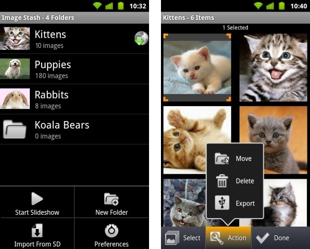
  • Added folder support. We got a lot of demand for this. You will now be able to organize your image stash into folders. Have full control over folder creation, naming, and which folder your images will be saved into.
  • Added stash management and image export. With the addition of folders, we’ve given you more power over organizing your images. By selecting the “Organize” menu option in the image stash gallery, you will be able to multiselect images and then delete them, move them to other folders, or export them as JPG files to your device.
  • Added feature “Save Link to Image Stash”. If you wish to save a full resolution image without having to open its thumbnail/link, selecting this option will quickly save the full size image to your stash.
  • Added visual feedback for closing a tab.
  • Several minor improvements and bug fixes.

Expect to see the update in the coming weeks! If you enjoy using Frost please consider rating it on the Android market!
Update 1.1 Released for Frost

Users of both full and lite versions of Frost should start seeing a new available update. Thank you to everyone who has contacted us with suggestions and feedback, it has become a big part in further developing this application. Version 1.1 includes the following new features and fixes:

  • New shortcut: double tapping the back button when there are no more pages to navigate back to will close the current tab
  • New option: set browser plugins such as flash to “Show On Demand” (Android 2.2+ only)
  • New option: set a custom homepage – available only in the full version of Frost
  • Added support for PNG files and improved JPEG file detection when importing from SD card
  • Fixed issue clearing cookies under rare conditions (Thanks karmarxist!)

Frost Browser 1.0 Released!

We’re proud to release the first version of our private browser for the Android platform – Frost!

You can view it on the Android Market

Frost is a tabbed internet browser with a hidden, password protected image and bookmark stash as well as extensive privacy features. Frost is ideal for viewing adult websites, dating sites, gift shopping, banking, and saving images and bookmarks with complete privacy.

With Frost, you can be confident that your privacy is protected.

Consider upgrading to the full version with unlimited image stash space and no ads!

Features:

✓ Fast, full featured tabbed browser with plugin (Flash) support, popup blocker, and user agent switching

✓ Automatically clears all browsing history when you close the app

✓ Download images from the web and save bookmarks into a hidden, password protected stash

✓ Frost looks and functions like any other innocent browser, until you enter your password into the address bar, which reveals your image and bookmark stash

✓ The contents of your stash is hidden from other apps (such as gallery or camera) and not viewable on a computer

✓ The image stash contains a gallery of all your private images, as well as a complete picture viewer with full zooming and slideshow support

✓ Import pictures from your SD card into your image stash

✓ Polished, simple design makes the most of your screen size

✓ Tablet support

Note: Flash support requires installing the Adobe Flash plugin, available on the market.

Javascript error “Library not registered” or “Element not found” in Sharepoint

These errors appear when trying to use some javascript enabled features in SharePoint. The error is triggered when running the command IMNControlObj.OnStatusChange=IMNOnStatusChange; inside of init.js. This command triggers a call to the Name.NameCtrl.1 ActiveX Control. This control is contained within name.dll which is included with all office installations. A conflict is caused when attempting to load this library due to a broken reference inside of the windows registry. In my experience this is common when upgrading from Office 2003 to Office 2010, as the references to the new name.dll are not updated.

To solve this issue you must run the repair wizard from within an office application, the process of which will depend on the version installed. I will use Word as an example since it is the most popular case.

Word 2003

Enter the Help menu, then select Detect and Repair. Make sure “Discard my customized settings and restore default settings” is checked.

Word 2007

Click the Office button, select Word Options, goto the Resources tab and finally, Diagnose.

Word 2010

Office 2010 products don’t have any repair function available. However, the old repair feature from previous versions of word are still accessible through code, and will solve our problem.

Create a macro. Under the View tab, select View Macros. Enter a macro name, “RunRepair” for example, and click Create. The script editor will open with a stub Sub created for you. Edit the code so it resembles the following:

Sub RunRepair()
    Application.CommandBars.FindControl(ID:=3774).Execute
End Sub

Save your macro and return to the View Macros window. Select your macro and click Run. The repair wizard should appear. Make sure you check “Discard my customized settings and restore default settings” before running the wizard.

Move a ClickOnce Deployment to Another Server or Location

The goal of this post is to demonstrate how to move a clickonce deployment to another location, be it another server or another folder, without having to publish the package again.

You will need a tool called MageUI.exe which is available for download in the .NET SDK. Once installed you can find it in “Program Files\Microsoft SDKs\Windows\v6.0A\bin\MageUI.exe”.

The first step is to simply copy over the clickonce deployment folder to your new location. Next, open up MageUI.exe and select the Open command from the file menu. Search through your clickonce deployment folder for all instances of *.application files and open all of them. This is important as you will need to make changes to all *.application files for this to work.

For each *.application file, under deployment options, you will need to edit the start location to reflect on the new location you are moving your deployment to. Once you have done this for all files select the save all command from the file menu. You will be prompted to sign your package. One option for signing your package is to generate a .PFX file and point to that, providing the password that you specified when creating it. The other option is to point to a certificate that has already been stored on your machine.

Once saved, test the new deployment location by running the setup file.

Solution: Checked Out Items or Documents When Uploading Multiple Documents in SharePoint

I came across a situation where I was uploading multiple documents into a SharePoint library using the multiple upload interface as well as the Explorer view. In both situations the documents would be uploaded, but they would all be checked out.

This is caused by two things:

1. You have at least one column in the library configured to be a required field.

In the case where multiple documents are uploaded, you are not prompted to fill in these required fields, as you normally would when uploading a single document. As a result the document is viewed as “incomplete” by SharePoint.

2. Under the library’s Version Settings, “Require Check Out” is set to “Yes”.

Even if the library has no required fields, if this value is set to true, your batch uploaded documents will be initially checked out.

The Right? Solution

Instinctively the proper solution would be to have a workflow trigger on item creation that simply checks in the document. However we run into a problem: Sharepoint will not initiate workflows on checked out items until they are checked in.

Crap.

The Ghetto Solution

Configure your required fields to be optional. Add a default value to them to be applied to your newly uploaded items.

Set “Require Check Out” to “No” under Versioning Settings in the document library’s settings.

You can now do a batch upload of documents, and they will appear in you library as checked in. Any workflows you have that are triggered upon document creation will successfully run.

What makes this solution so ghetto is that you now have to go back into your document library settings and revert the changes you initially made. So set your fields back to being required, changing their default values if needed. And set “Required Check Out” back to its initial value.

In case you are worried, existing documents will not be affected by these changes to the settings. So documents that are already checked out, or have different field values will be safe. Your document library will behave just as it originally did, assuming you correctly reverted the settings.

Removing or Hiding the Approval and Collect Feedback Workflows in SharePoint

When a user wants to initiate a workflow for an item in a workflow they are presented with a page that lists all the available workflows for that item type.

By default, SharePoint will display the “Approval” and “Collect Feedback” workflows for items of the “Document” type.

In order to remove these workflows from this, or any other item type you must do the following:

  1. Goto into the Site Settings of your parent site in your site collection.
  2. Under the Galleries column, goto Site Content Types.
  3. You will now see a list of all the content types for this site collection. Select the content type you wish to remove the workflows from. In this case we will select Document.
  4. We want to manage the workflows for this content type, so select Workflow Settings.
  5. Select Remove a Workflow.
  6. You should see the workflows in question listed with 3 choices: Allow, No New Instances and Remove.
    • By selecting no new instances, existing workflows will be allowed to complete, without allowing any further to be started.
    • By selecting remove you will simply remove all associations that workflow has with that item type, terminating any pending workflows.
  7. Select Remove for bother Approval and Collect Feedback Workflows and click OK.

This will prevent the workflows from appearing in the workflow initiation page for those content types.

Embedding FLV Flash Movies into your SharePoint site

FLV files are simply a container movie file, and in order to present them to the user in a manner in which they will be able to control the playback of the movie you need to wrap them in an SWF playback control. Embedding flash video into a SharePoint site isn’t that much different than doing it in any other site. The only challenge is figuring out where and how the required files will be hosted and made accessible by the SharePoint site and its users.

I’m assuming you already have an FLV file, if not there are several converter applications available that will create FLV files out of common video formats. The next step is to find an FLV player that will present the video on our site. There are several third party FLV players available, many for free although some require licensing for commercial use. I’ve listed some here:

Each player has their own way of embedding, in this example I will use JW player. They have a neat tool on their site that you can use to generate the code needed to embed your video.

The player does require several files to be hosted and made readable by the user who will have access to the videos. You can create a dedicated document library and upload the appropriate files included in the FLV players package and then use the absolute URL in your embed code to reference them. Be sure that the users who will be watching the video have read access on the document library the FLV player files are stored in.

You then create a content editor web part in which you want the video to appear in and place the embedding code in the source editor. Here’s an example of JW Players embedding code:

<script type="text/javascript" src="http://www.mysite.com/JWPlayer/swfobject.js"></script>
<div id="mediaspace">This div will be replaced</div>
<script type="text/javascript">
  // <![CDATA[
  var so = new SWFObject('http://www.mysite.com/JWPlayer/player.swf','mpl','220','165','9');
  so.addParam('allowfullscreen','true');
  so.addParam('allowscriptaccess','always');
  so.addParam('wmode','opaque');
  so.addVariable('file','http://www.mysite.com/test.flv');
  so.addVariable('image','http://www.mysite.com/previewimage.jpg');
  so.addVariable('stretching','fill');
  so.write('mediaspace');
  // ]]>
</script>

In this case I placed all the FLV player files in the JWPlayer directory on “mysite” and am referencing the FLV file I want to have played.

Converting System.Data.LINQ.Binary to an ASCII Encoded String

I ran into a situation where I was storing files in a database as a binary field. Some of these files were in HTML format and I wanted to dynamically display them inside of some ASP pages I was developing. After a bit of research I was finding a lot of other solutions people were using involved timestamp conversions which were not ASCII based like HTML. The following code will convert your binary object into ASCII and display it as it was originally uploaded.

byte[] myByteArray = myBinaryObj.ToArray();
System.Text.ASCIIEncoding enc = new System.Text.ASCIIEncoding();
string result = enc.GetString(myByteArray);

How To Find, Select and Format Icons For Your Applications

Whether you do web design or desktop application development, you’re eventually going to need to include icons in your interface. Not all software developers are handy with image editing software, we can use it, like most people know how to use a paint brush, it’s just that we have trouble using the tool to make something that would meet our users expectations. Luckily there are a lot of free resources out there that provide premade icons created by people who have artistic talent.

Icon Finder – Provides a Google like image search that only returns icons
Tango Desktop Project – A pack of icons available in every format and resolution you would ever need, licensed under GPL.
Famfamfam – A collection of icons with a simple and minimalistic style to them. There’s also another pack in the same style available here.
Pixel Resort – Fairly new site, with a rapidly growing collection of icons.
Deviant Art – Probably one of the largest collections available, however it’s really hit or miss, you can find some really nice sets if you can spare the time.

It’s very likely you will find an icon that you like but isn’t provided in the size or format you’re looking for. In this case I recommend downloading Paint.NET which is a free image editing program that has excellent plugin support. If you’re working on a desktop application and require icons in .ICO format you can download the ICO plugin for Paint.NET here.

I guess now would also be a good time to talk about what image format to use for you icons. The best format for most applications is PNG. It’s small, no visible compression artifacts and supports alpha transparency. Applications built in Visual Studio support PNG icons along with transparency as do all modern browsers. As is usually the problem, Internet Explorer is the black sheep of the crowd and needs special attention when it comes to PNGs. There are still quite a few people using IE6 which does support PNGs but not PNG transparency. There is a solution to this using javascript within your CSS file to load the appropriate libraries to handle the transparency, however there are some major drawbacks to doing this as discussed here. IE7 introduces PNG transparency support, however still has the problem of incorrectly rendering colors in PNG files, seemingly oversaturating them. The next alternative is the GIF format, which also doesn’t have visible compression artifacts and allows for simple non-alpha transparency. Avoid using JPEGs whenever possible.

As far as what you should look for when choosing an icon, try to keep a consistent theme amongst your application, mixing icons from different collections and artists can give the application a rough and inconsistent feel. Apple has an article aimed at developers outlining their guidelines for icon selection and placement. While some of it is Mac specific, many ideas can be related to all applications regardless of platform or OS. Here are some highlights from the article:

  • The icon should contain a tool that communicates the type of task the application allows the user to accomplish. The Preview icon, for example, uses a magnification tool to help convey that the application can be used to view pictures. If you include a supportive tool element, it should closely relate to the base object that it rests upon.
  • Some applications that represent objects, such as QuickTime Player and Calculator, are most easily recognized by the objects themselves. When creating icons for such applications, it’s more aesthetically pleasing to create a simplified, idealized representation of the object, instead of using an actual screen shot of the software. Re-creating the object is particularly important when users could confuse the icon with the actual interface.
  • Because utility applications are normally focused on a narrow set of tasks, it’s best to keep the number of elements in the icon to a minimum. The focus should be a single object that represents what the utility does.
  • The primary purpose of a toolbar is to provide users with easy access to frequently used commands. Although toolbar icons should conserve screen real estate they should be inviting and easy to identify. Ideally, each toolbar icon should represent a unique object or action that is directly related to the command it represents. A toolbar can also contain icons that represent recognizable interface elements from elsewhere in the system when they make sense in the context of the application. If you choose to include an icon such as an Info button, be sure to preserve its meaning. Users expect such icons to mean the same thing in every context, so you should not redefine them when you use them in your toolbar.
  • Do not use a system icon, such as the yellow caution icon, in your toolbar. A system icon provides important information to the user in a specific context, such as in an alert window; using it in a toolbar blurs its meaning and dilutes it effectiveness in the system.
  • Making each toolbar icon distinct helps the user associate it with its purpose and locate it quickly. Variations in shape, color, and image all help to differentiate one toolbar icon from another. At the same time, however, an application’s toolbar icons should harmonize together as much as possible in their perspective, use of color, size, and visual weight.
  • Creating a family of visually related toolbar icons can strengthen the user’s perception of your application as being well-integrated and well-designed. One way to do this is to start with a consistent theme for the style and appearance of the icons, then introduce variations when it makes sense.
4 of 5
12345